Bootstrap 4 Tutorial: Create a One-Page Template – Designmodo
Bootstrap • CodingSam Norton • October 01, 2015 • 8 minutes READ
Bootstrap 4 is here and there are plenty of changes and new features.
Today you will learn how easy it is to create a one-page HTML responsive template using Bootstrap 4. At the end of this Bootstrap 4 tutorial, you will understand how to set it up as well as how to use some of the new features in Bootstrap 4.
In this article, you’ll learn about:
Also, you can watch the video version of this tutorial on YouTube:
Before begin, make sure to have a code editor such as Sublime text or Notepad++ and some working knowledge of HTML and CSS.
With Postcards Email Builder you can create and edit email templates online without any coding skills! Includes more than 100 components to help you create custom emails templates faster than ever before.
Looking for a Bootstrap online builder?
Resources you need to complete this tutorial:
Folder Structure
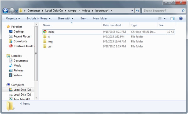
For this tutorial, our folder structure will consist of three folders and one HTML file:
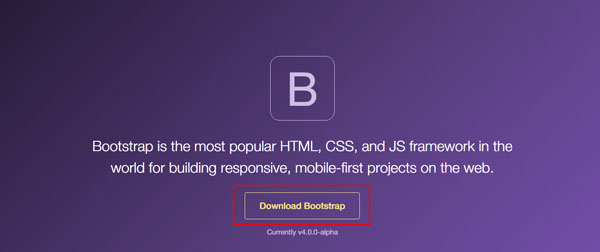
There are two versions available for download: Bootstrap compiled version and Bootstrap source files.
However, the compiled version is not yet available at the time of writing. You can download the Bootstrap source files here.
With Startup App and Slides App you can build unlimited websites using the online website editor which includes ready-made designed and coded elements, templates and themes.
For this tutorial, we will focus on picking up the necessary files that we need for our one-page responsive template.
Note: I will create a separate tutorial in the near future on how to set up and use Bootstrap 4 Alpha via SASS.
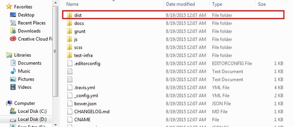
Once downloaded, unzip the Bootstrap source files and copy the following files inside the dist folder. You can get these files inside the css and js folder upon opening the dist folder.
In addition, we need to download tether.min.js file or use its CDN version from their website for us to be able to use tooltips in Bootstrap 4 Alpha. Place this file inside the js folder of our project.
Our HTML document will begin with the HTML5 <!DOCTYPE> to specify which language and version our document is using. Then on our <head> section we can place all of our CSS, JavaScripts and fonts/images links. For performance purposes, you may wish to place the JavaScript files at the bottom of the document (just before the closing </body> tag).
We may also add the following code to force Internet Explorer to render to its rendering mode and the meta viewport property for responsive view.
To start, we will use the template below as our starting HTML for our one-page responsive template. Notice that I’ve added some hosted library links such as Font Awesome and Google Fonts.
The Bootstrap 4 grid system can have 12 columns and you can choose which column scale you want to display on different viewport sizes. Check out the Bootstrap 4 medium grid below with classes.
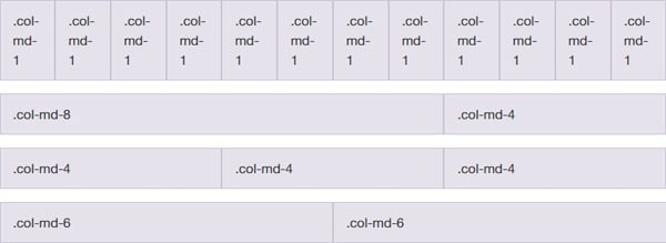
We will not be talking much about the grid system in depth in this tutorial, however we will go straight on the column scale that we’re going to use on our one-page template.
Let’s first wrap everything inside a div wrapper class and then divide each part of our documents via section tag and place classes specifically for each.
Next, we will add the bootstrap’s container class to wrap elements and contain its grid system. We will be using a fixed container. This means that as the viewport changes, its width remains intact until it meets certain breakpoints.
Note that we will not put a container div on the header section as we want it to expand all throughout the browser size. Let’s do that now.
To continue, we need to add rows and columns inside container divs. The basic purpose of rows is to wrap up column while column contains the content. Let’s start adding rows and columns with some additional classes. Do not worry about these classes, we will talk more about them later.
Jumbotron draws marketing messages and calls to action. Bootstrap Jumbotron (formerly hero unit) is a large banner like section with large text, light gray background wrap with box that has a border radius in it.
To create a Jumbotron, you need to add the jumbotron class to a div element and then add header tags to it. On our template, we’re going to use jumbotron class but we’ll customize how it looks. To make it a more modern template, we’re going to use jumbotron to create a parallax displacement effect. Add the code below inside the header section.
Note: We’ve also added a jumbotron-fluid class to make it fluidly responsive.
Bootstrap has special classes for displaying headings that designed to stand out more than the normal headings. Basically, there are four size/class display headings:
A larger number means bigger text size. In our example above (header section), we’ve used display-2 inside the h2 tag these will render the text on second size level.
Now, let’s add the following code to our About Us section:
There’s nothing special in this code; I just added a div with classes along with images and header tags inside but notice the <mark> tag. This is an HTML5 element to represents text as marked or highlighted to emphasize a word or a sentence. Basically Bootstrap also has its own rendering on this element. See the image below.

We will discuss typography classes more in a separate article.
Cards are new components in Boostrap 4 Alpha. Cards work as a container with light styles in replaced with wells, panels and thumbnails. It supports a variety of style options such as alignment, colors, headings and more.
To create a card, simply add the card and card-block classes to a div. For its title add card-title class and card-text for its regular text.
Copy and paste and paste the code below to your markup inside the About Us section.
Bootstrap 4 Alpha requires a third-party library called tether to enable tooltips. To use tooltips simply include tether.min.js just before the bootstrap.js file.
To use tooltip via tether simply create a link the attribute data-toggle=”tooltip” and then include your text tooltip inside the title attribute. Check out the sample code below.
On the example above we’ve used anchor tags but tooltips is not limited only on this. You can also use it inside buttons and divs. To initialize all tooltips on a page you need to add a JavaScript code below the tether.min.js source link to select tooltips by their data-toggle attribute.
You can simply use the following code.
Let’s see it in action in our features section. Copy and paste the code below inside the col-lg-12 class.
Bootstrap 4 Alpha has added a new prefix –inverse class that inverts the color of the table itself.
Add the class table-inverse to enable this feature.
Let’s see in action. Copy the code below inside the features section right after the code above.
As you can see there is nothing special here just a regular table but Bootstrap 4 will handle the styles. See the image below.

Bootstrap 4 Forms are responsive that stacked vertically on viewports by default using the display: block and width: 100% styles. These gives the user a better look on all viewports, but can still be customized.
To use Bootstrap’s Form, simply add the form-control class on all of the field sets such as input, text-area and so on. You also need to add <fieldset> tag along with the form-group class inside it.
Let’s see this in action. Replace the code you’ve set on the contact us section with the code below.
Notice that I’ve also added some support class alert-success to notify the user that the form was successfully submitted.
Bootstrap 3 offers a dozen reusable glyphicons components which can be used for different purposes. For Bootstrap 4 Alpha this feature was dropped. For our footer section we’re going to include Font-Awesome (https://fortawesome.github.io/Font-Awesome/ ) icon classes for our social media icons. Copy the code below in your footer section.
With all of the code we’ve written so far, you will have exactly the same output as the image below.
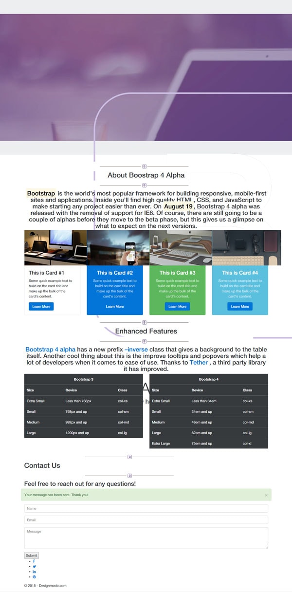
Now that we have everything set up on our HTML, we need to customize our styles to make our one- page template look awesome. Open up the custom.css and add the general styles below for our basic elements and classes.
Next, we will set up some styles for our parallax effect via parallax and parallax-pattern-overlay class.
For our heading class we need to set up a specific maximum width of 960px and then give each header tags some font-size and some more styles to emphasize each.
Next, let’s add some styles to our forms. The Bootstrap default forms will have a normal amount of padding and a nice border radius but for our one-page responsive template we’re going to apply a flat design concept. Copy and paste the styles below.
Afterward, let’s add styles to the footer. We will set up a nice background color light violet and give some styles for our footer text and icons. Nothing special here.
As a final touch, customize some elements on 768px viewport via media queries specifically with some of our columns sizes to make it look good on this screen size.
Conclusion
There you have it! Feel free to customize the design or the code that we set up above.
Remember that at the time of this article, the first alpha version of Bootstrap 4 was just released — that means there might be few alpha series in the near future so it’s good to check out their official website once in a while.
If you want to learn more about Bootstrap 4, you can always refer to the documentation here.
Check out and download to see the Bootstrap 4 template in action.
Did you learn a lot on this tutorial? Leave a comment below and let us know what you think.
Sam is an expert Full Stack Developer who loves making digital solutions that are meaningful and new. Sam is an expert in web design and development. He uses his knowledge of HTML/CSS, JavaScript, jQuery, Ruby, Ruby on Rails, WordPress, Node.js, React, Express.js, Gatsby.js, GraphQL, and Strapi.js to make custom websites that reflect clients' unique brands and serve their business niches. Committed to staying ahead of the curve, Sam harnesses the power of the latest technologies, CMS, and platforms to build cutting-edge websites that outperform competitors.
Designmodo offers advanced drag and drop website and email builders for web designers and developers, we have everything you need to make money.
Designmodo Inc. 50 N 1st St, 4i, Brooklyn, NY 11249, United States
Copyright © 2010-2024
We create beautiful website and email builders, helping 30,000 customers to grow their business.
A simple tool to create emails and newsletters.
Create an animated website in minutes.
A perfect tool to create Bootstrap website.
Earn 25% commission on affiliate sales. We have everything you need to make money.
Our useful services seamlessly integrated with each other and our products to get you to the finish line faster.
Drag-n-drop solution for your static website to quickly host your static website.
Design in the cloud and create new websites seamlessly, without any coding skills.
Talk to your audience at scale. Send your email marketing campaign quickly and easily.
Get website downtime alerts by phone call, SMS, email, Slack, etc when your website went down.
We use cookies to ensure that we give you the best experience on our website. Privacy Statement.
Get started with the most advanced email builder for your next campaign or newsletter.
A perfect tool to create website or prototype projects. It will fit all kinds of projects.
Create an amazing static website in minutes and export ready-to-use template.
Get started with the most advanced email builder for your next campaign or newsletter.
A perfect tool to create website or prototype projects. It will fit all kinds of projects.
Create an amazing static website in minutes and export ready-to-use template.
Create an amazing static website in minutes and export ready-to-use template.
source


